Best Practices for Mobile-First Web Design in 2025
Spread the love
Did you know that over 60% of web traffic comes from mobile devices?
In today’s digital world, mobile-first web design is no longer an option—it’s a necessity.
With most internet users accessing websites through their smartphones, businesses must prioritize building mobile-friendly websites to stay competitive. This design strategy ensures your website is optimized for smaller screens first, then scales up for larger devices like tablets and desktops.
What is Mobile-First Web Design?
Mobile-first web design is a development approach where the primary focus is on creating a seamless experience for mobile users before designing for desktops. This method involves designing and coding for smaller screens initially, ensuring fast load times, responsive layouts, and easy navigation. As mobile usage continues to grow, this approach helps businesses provide a smooth and efficient user experience across all devices.
A key principle of this approach is simplicity. Websites designed for mobile users must load quickly, display content clearly, and allow for easy interaction. This ensures that your audience can access information effortlessly, improving overall engagement.
Importance of Mobile-First Approach in 2025
By 2025, mobile usage is expected to account for over 75% of global internet traffic. As search engines like Google prioritize mobile-friendly websites through mobile-first indexing, businesses without a responsive design risk losing both traffic and customers. Adopting a mobile-first approach enhances user experience, reduces bounce rates, and improves search engine rankings.
For website design and development companies, this approach is crucial. It ensures that every website meets modern usability standards while aligning with the latest SEO best practices. A well-optimized mobile site can also increase conversions, as customers can navigate and complete purchases effortlessly.
How Mobile-First Design Impacts User Experience and SEO
A website designed with a mobile-first approach directly enhances user experience by offering faster page loads, clear call-to-actions, and smooth navigation. This positive experience not only retains visitors but also encourages them to explore more pages, increasing the chances of conversion.
From an SEO perspective, mobile-first web design is critical. Google’s algorithms prioritize mobile-friendly websites, meaning a site that performs well on mobile devices is more likely to rank higher in search engine results. Furthermore, fast and responsive designs reduce bounce rates, which signals to search engines that your content is valuable and relevant.
In a world where attention spans are shrinking, businesses that invest in website design and development with a mobile-first approach are setting themselves up for long-term digital success.
Why Mobile-First Design is Crucial for Ecommerce Websites
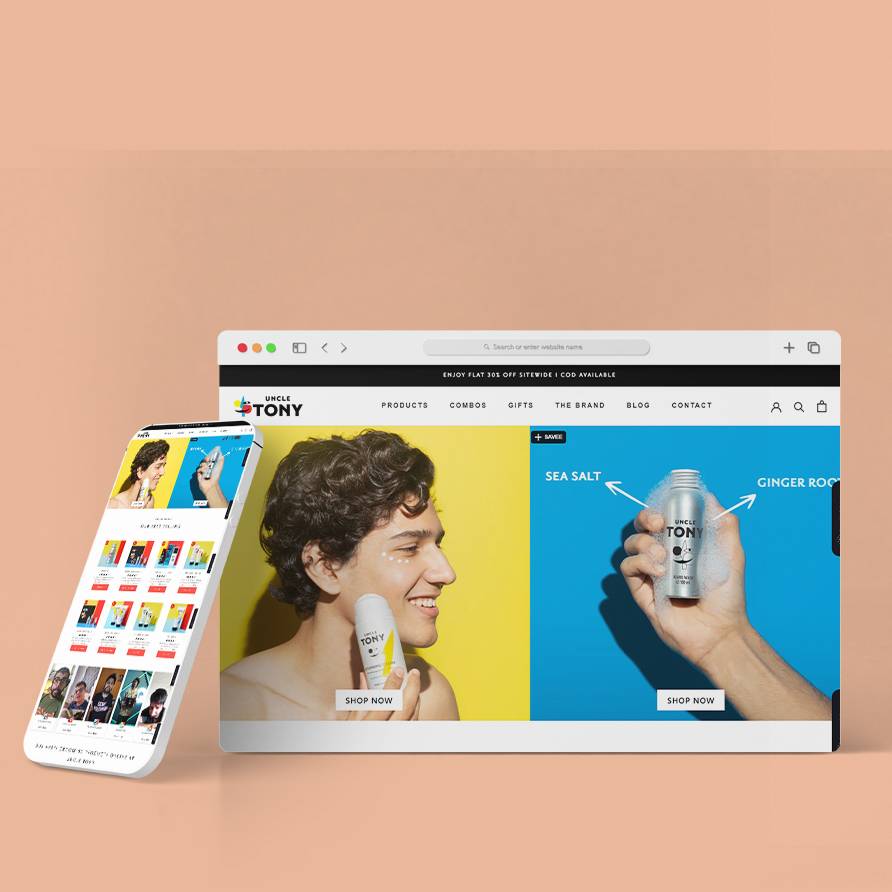
In the fast-paced digital age, a mobile-first ecommerce website is essential for business success. With more people shopping online through their smartphones, having a website that prioritizes mobile users is no longer optional—it’s a must. By focusing on responsive website design, businesses can deliver a smooth shopping experience, driving customer satisfaction and increasing sales.
Rising Mobile Traffic and Consumer Behavior
Rising Mobile Traffic and Consumer Behavior Mobile devices now dominate online shopping. Studies show that over 70% of ecommerce traffic comes from smartphones. Consumers expect fast, easy-to-use mobile platforms where they can browse products, make purchases, and receive support effortlessly. If your website isn’t optimized for mobile, you risk losing potential customers to competitors with a better mobile-first ecommerce website.
Google’s Mobile-First Indexing and Its Impact
Google’s mobile-first indexing means the search engine primarily uses the mobile version of your site for ranking and indexing. If your ecommerce site isn’t mobile-friendly, it may struggle to rank high in search results, limiting your reach. A responsive website design ensures your store meets Google’s standards, improving visibility and attracting more organic traffic.
How Mobile Optimization Increases Conversions
A mobile-first ecommerce website enhances user experience, leading to higher conversions. Fast load times, easy navigation, and clear call-to-action buttons encourage users to complete purchases. Businesses investing in ecommerce website development with a mobile-first approach see better customer engagement and increased revenue.
To stay ahead in a mobile-driven world, prioritize mobile-first ecommerce development. Ensure your site is fast, user-friendly, and optimized for mobile shoppers to boost sales and customer loyalty.
Table of Contents
Key Principles of Mobile-First Web Design
When designing a website with a mobile-first approach, several key principles guide the development process to ensure a seamless user experience across all devices.
Prioritizing Content for Mobile Devices
One of the most important mobile-first design principles is focusing on essential content for mobile users. Since mobile screens are smaller, it’s crucial to prioritize the most important information—whether it’s product details, contact information, or calls to action. Simplifying and structuring content for quick access ensures that users can easily find what they’re looking for without unnecessary scrolling or clicking.
Responsive and Adaptive Design Techniques
A responsive web design is fundamental in mobile-first web development. It ensures that your website adapts to any screen size, providing an optimal viewing experience. Whether the user is on a mobile, tablet, or desktop, the layout adjusts to fit the screen. Additionally, adaptive design techniques can offer customized experiences based on device capabilities, making your website even more user-friendly.
Fast Loading Speed and Lightweight Code
Fast-loading websites are crucial for mobile-first design. Mobile users are often on the go and expect quick access to content. Slow-loading websites can lead to high bounce rates, negatively impacting both user experience and SEO. Ensuring your site uses lightweight code and optimized images can dramatically improve load times and overall site performance.
Implementing mobile-first design principles ensures your website is fast, user-friendly, and SEO-optimized—helping you attract and retain more mobile visitors while staying ahead of the competition.
Best Practices for Mobile-First Website Design in 2025
As mobile usage continues to surge, adopting the best mobile-first design practices is crucial for businesses looking to stay competitive. Here are some key strategies for creating a mobile-optimized website in 2025.
Designing with a Mobile-First Mindset
Start by designing your website for mobile devices first. This ensures that you focus on the most important content and features, simplifying the user experience. Prioritize clean, intuitive navigation, and avoid overcrowding the screen with excessive elements. A user-friendly website built with a mobile-first mindset provides a seamless experience, whether on a smartphone or a desktop.
Using Flexible Layouts and Grids
Mobile screens vary in size, so it’s essential to use flexible layouts and grids. These allow your website to adapt to different screen dimensions, ensuring it looks great on all devices. By applying mobile-first design strategies, you ensure that your site’s layout adjusts fluidly as the screen size increases, from smartphones to tablets to desktops.
Optimizing Images and Multimedia for Mobile
Large images and heavy multimedia files can slow down your website’s performance, especially on mobile. Compress images and use responsive design techniques to ensure that they load quickly without sacrificing quality. This mobile website optimization not only improves load times but also enhances the overall user experience.
Touch-Friendly Navigation and Button Placement
Mobile users interact with websites through touch, so it’s vital to design large, easy-to-tap buttons and links. Place key calls to action (CTAs) in areas where users can easily access them. This ensures touch-friendly navigation, increasing the chances of user engagement and conversions.
Ensuring Cross-Browser and Device Compatibility
Test your website on various browsers and devices to ensure consistent performance. Compatibility is crucial to avoid frustrating users with design or functionality issues. A well-optimized mobile-first site will work seamlessly across all platforms, offering a unified experience for all users.
SEO Best Practices for Mobile-First Websites
In today’s digital age, optimizing your website for mobile-first indexing is crucial for better search engine rankings. Here are key strategies to enhance your mobile SEO:
1. Implementing Mobile-First SEO Strategies
Google prioritizes the mobile version of your website for indexing and ranking. Ensure that essential content, meta tags, and headers are consistent across both mobile and desktop versions.
✅ Tip: Optimize mobile pages by including clear calls to action (CTAs) and ensuring all keywords are mobile-friendly and easy to access.
2. Using Structured Data and Schema Markup
Schema markup helps search engines understand your content and improves your chances of appearing in rich snippets. Ensure your mobile site includes properly optimized structured data for better indexing.
✅ Tip: Use tools like Google’s Rich Results Test to verify your schema implementation on mobile pages.
3. Enhancing Page Speed and Core Web Vitals
Google’s Core Web Vitals directly influence SEO rankings, especially for mobile-first sites. Focus on three key metrics:
Largest Contentful Paint (LCP): Faster loading of main content.
First Input Delay (FID): Quick interaction response time.
A great mobile user experience (UX) focuses on making websites intuitive, accessible, and engaging. Here are three mobile UX design strategies to improve your mobile website and boost user satisfaction and conversion rates:
1. Simplifying Navigation for Mobile Users
Simplicity is key in mobile-first design. Ensure users can find what they need quickly by providing:
Clear Menus: Use simple, collapsible navigation menus for easy access and faster browsing.
Touchable Elements: Design with large touch targets, such as buttons and spaced-out links, to improve mobile usability.
Prioritized Content: Display important links and key pages at the top to minimize scrolling and improve user engagement.
2. Enhancing Readability and Accessibility
Legible Fonts: Use a minimum font size of 16px to improve readability on smaller screens.
High Contrast: Ensure text-to-background contrast meets WCAG accessibility standards for better mobile accessibility.
Accessibility Features: Include alt text for images, provide keyboard navigation, and ensure compatibility with screen readers.
3. Personalizing User Experience with Mobile Analytics
Use mobile analytics tools to track user behavior and deliver a personalized mobile experience:
Track User Data: Monitor user journeys to understand how visitors interact with your mobile site.
Tailored Content: Offer personalized recommendations and dynamic content based on user preferences.
Behavior Insights: Use heatmaps and session recordings to analyze click patterns and identify UX pain points.
By simplifying navigation, enhancing accessibility, and leveraging user data, you can create a mobile-friendly website that delivers a seamless user experience, improves SEO rankings, and boosts conversion rates.
Mobile-First Design Tools and Technologies
When developing a mobile-first website, selecting the right mobile-first design tools and technologies is crucial for creating responsive, high-performing sites. Here are some key tools and technologies for mobile-first development.
Popular Frameworks for Mobile-First Development
Several responsive design frameworks help streamline the development of mobile-first websites. Popular frameworks like Bootstrap and Foundation offer pre-built components that adapt seamlessly to mobile devices. These frameworks ensure that websites are responsive from the start, allowing designers to focus on functionality and user experience.
Leveraging Progressive Web Apps (PWAs)
Progressive Web Apps (PWAs) are a powerful technology for enhancing mobile-first design. PWAs combine the best features of both web and mobile apps, offering fast load times, offline access, and push notifications. They help create a more app-like experience on mobile devices without the need to build separate native apps, ensuring a smooth user experience.
Tools for Testing Mobile Responsiveness
By using the right website design technologies and tools, businesses can create fast, responsive, and engaging mobile-first websites that meet the needs of modern users.
Common Mistakes to Avoid in Mobile-First Web Design
Effective mobile-first web design requires attention to detail. Common mistakes, like ignoring mobile testing, can harm usability. Always test across different devices using tools like Google Chrome DevTools to ensure smooth performance.
Another mistake is overloading with heavy media files, which slows down your site and affects SEO rankings. Optimize images using formats like WebP, compress files, and implement lazy loading for faster page speeds.
Neglecting mobile SEO and analytics is also a major error. Ensure meta tags, headings, and structured data are consistent across devices. Use tools like Google Analytics to track user behavior and improve site performance.
By avoiding these mistakes and focusing on mobile optimization, you can enhance user experience, improve search engine visibility, and ensure your website performs effectively across all devices.
✅Note : Regularly update and test your website to align with evolving mobile SEO best practices.
Future Trends in Mobile-First Website Design
The future of mobile-first design is evolving rapidly, with new trends shaping user experiences in 2025. Staying updated with these innovations is crucial for maintaining a competitive edge in the digital space.
🚀 AI Integration in Mobile UX
Artificial Intelligence (AI) is transforming mobile user experiences by offering personalized and intuitive interactions. From AI-powered chatbots that provide instant support to predictive search for faster results, AI is making mobile browsing smarter and more efficient.
🗣️ Voice Search Optimization
With the growing popularity of voice assistants, optimizing websites for voice search is becoming essential. By focusing on natural language queries and conversational keywords, businesses can improve visibility and cater to this expanding user behavior.
⚡ Accelerated Mobile Pages (AMP) Evolution
As AMP technology advances, websites will deliver even faster loading times on mobile devices. This trend enhances user experience and boosts SEO rankings, ensuring websites perform seamlessly across all screens.
Is your website ready for the future of mobile-first design? Stay ahead by embracing these trends to deliver faster, smarter, and more engaging mobile experiences!
Choosing the Right Website Design Company for Mobile-First Development
In today’s mobile-driven world, having a mobile-first website is crucial for online success. Partnering with the right website design company ensures your site is optimized for performance, user experience, and conversions across all devices.
✅ Why Partnering with Experts Matters
Mobile web design is constantly evolving, and working with experienced professionals ensures your site stays ahead. A mobile-first web development company understands the intricacies of mobile UX, SEO, and responsive design, delivering a seamless user experience on smartphones and tablets.
🔎 What to Look for in a Mobile-First Web Development Company
Choose a company with a proven track record in creating fast, responsive websites. Ensure they specialize in eCommerce development and mobile optimization techniques for a competitive edge
🚀 How Emavens Delivers Mobile-Optimized Solutions
At Emavens, we design mobile-first websites that enhance user engagement and boost conversions. Our expert team delivers responsive, fast-loading, and user-friendly solutions tailored to your business needs.
Adopting mobile-first web design is essential in 2025 for providing an exceptional user experience and improving your website’s performance. By focusing on mobile optimization, responsive design, fast load speeds, and mobile SEO, businesses can create websites that thrive on mobile devices and rank higher in search results.
At Emavens, we specialize in providing professional web development services tailored to your mobile-first needs. Our team of experts understands the importance of mobile-first best practices, ensuring that your website is optimized for mobile users while delivering a seamless experience.
Ready to take your online presence to the next level? Contact our web design company today for a free consultation and let us help you build a mobile-optimized website that drives results. Don’t miss out on the opportunity to reach your customers where they are—on their mobile devices. Start your mobile-first journey with Emavens now!